Mobility Infotech
Designing the white label platform behind 100+ mobility brands. A two sided rider & driver system, booking, fares, wallet, safety, built solo in 64 days to ship across web, iOS & Android.

I design products people understand, trust, and return to.
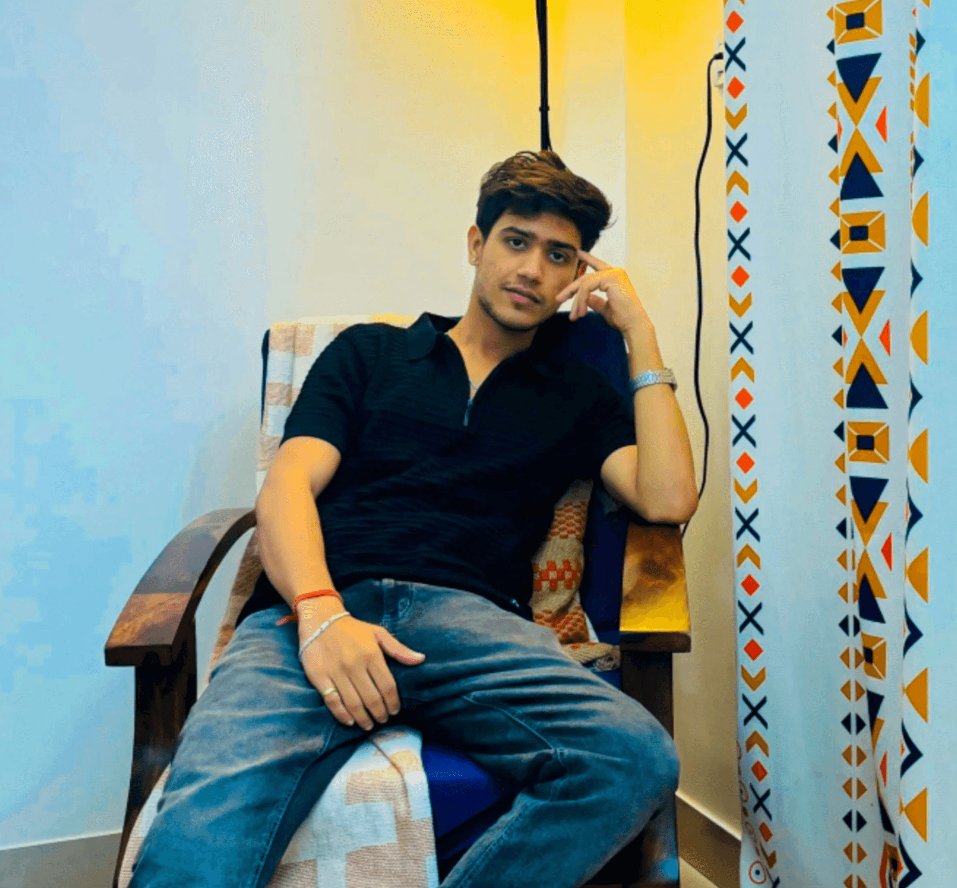
I'm Ashish, a Product Designer with 5+ years of experience turning complex product problems into clear, scalable experiences across SaaS, B2B, fintech, mobility, and logistics. I work across product strategy, user research, UX, UI, prototyping, design systems, and developer handoff, partnering closely with product and engineering teams to move ideas from ambiguity to launch.

Selected product work across mobility, fintech, B2B SaaS, digital assets, and intelligent productivity tools, with a focus on business impact and user clarity.
Designing the white label platform behind 100+ mobility brands. A two sided rider & driver system, booking, fares, wallet, safety, built solo in 64 days to ship across web, iOS & Android.
Designing trust and habit into India's daily commute. End to end product design & UX writing for a carpool and bikepool app, 500K+ users, 10M+ rides, and a three tier trust system that made sharing a vehicle feel safe.

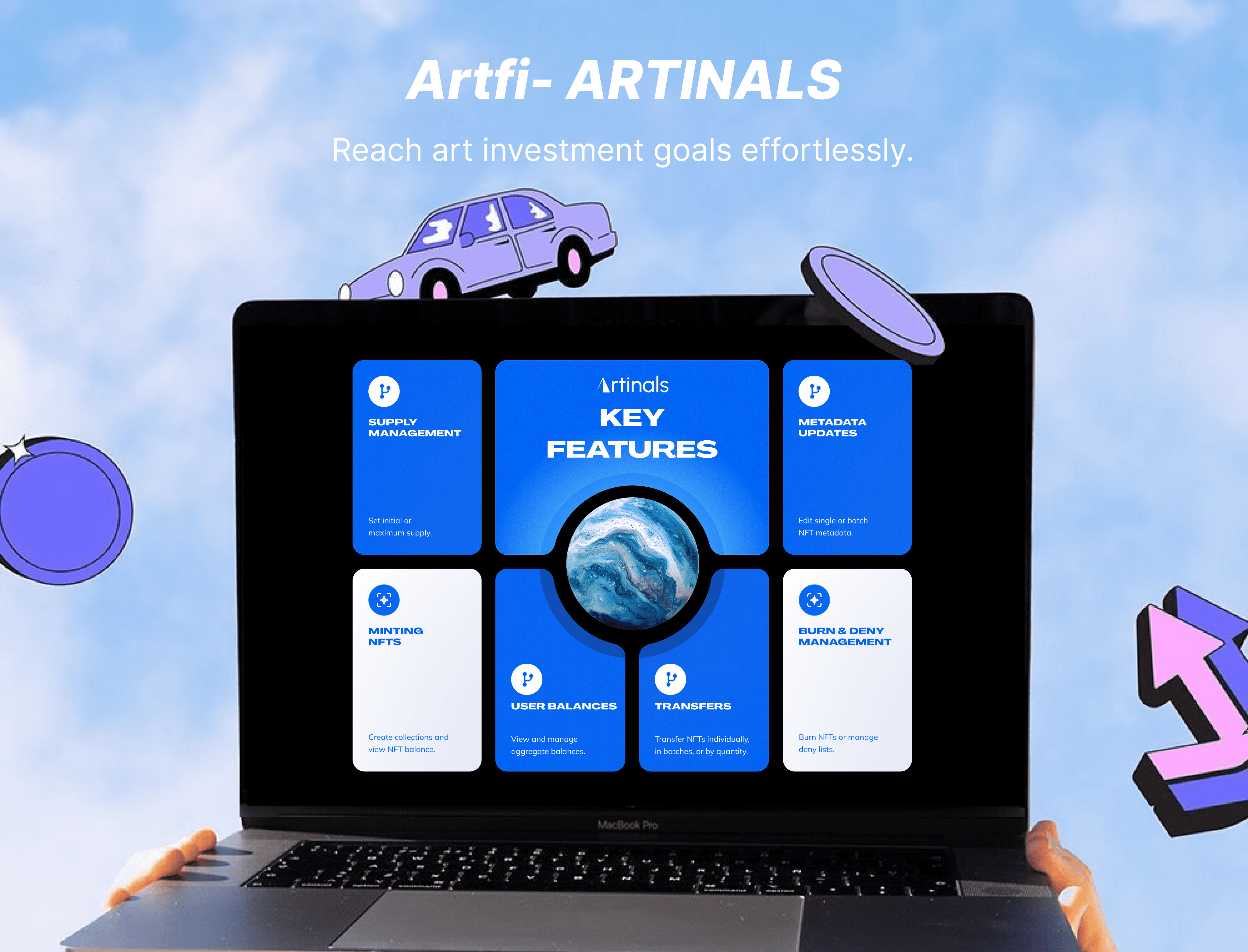
Simplifying art ownership in the on chain era. End to end design of a dashboard that centralises art investment, ensures real time updates, and scales for the future of digital collecting.
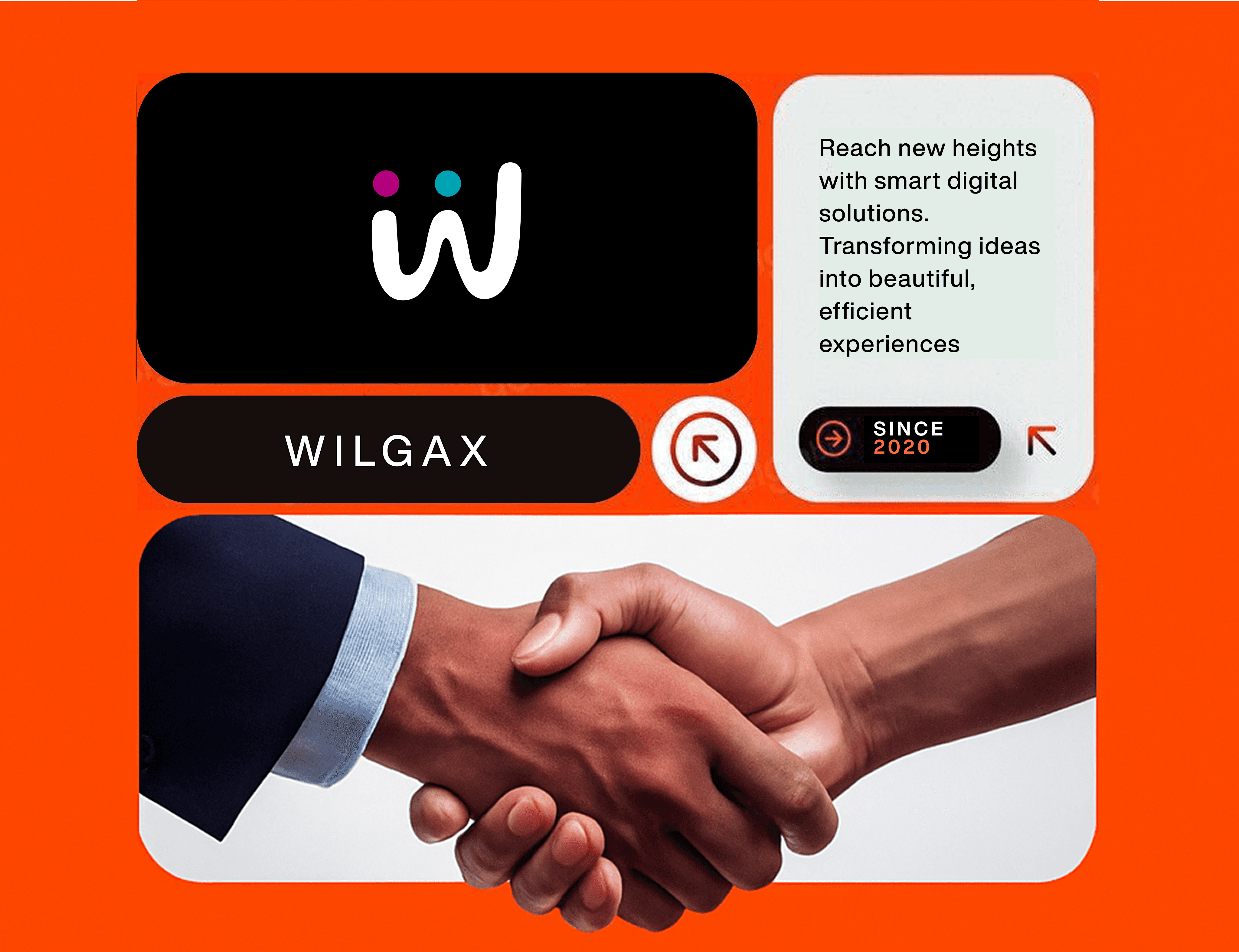
Designing a clear, conversion focused digital agency presence. A unified platform that streamlines lead generation, SEO, and client campaigns, giving teams more time to focus on strategy and impact.
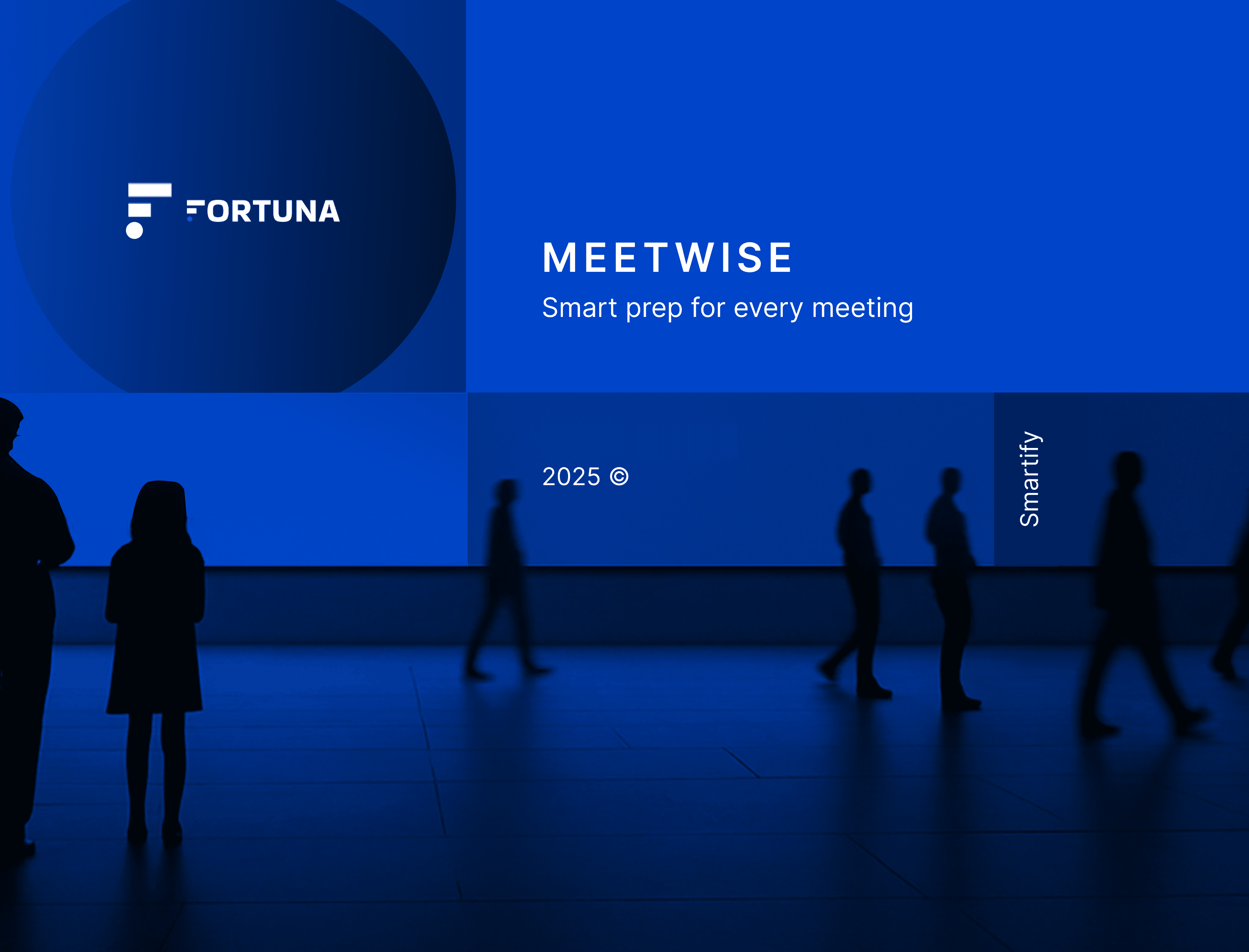
Designing a smarter meeting workflow. An AI enabled meeting assistant that automates prep, delivers instant insights, and makes every client interaction more meaningful.
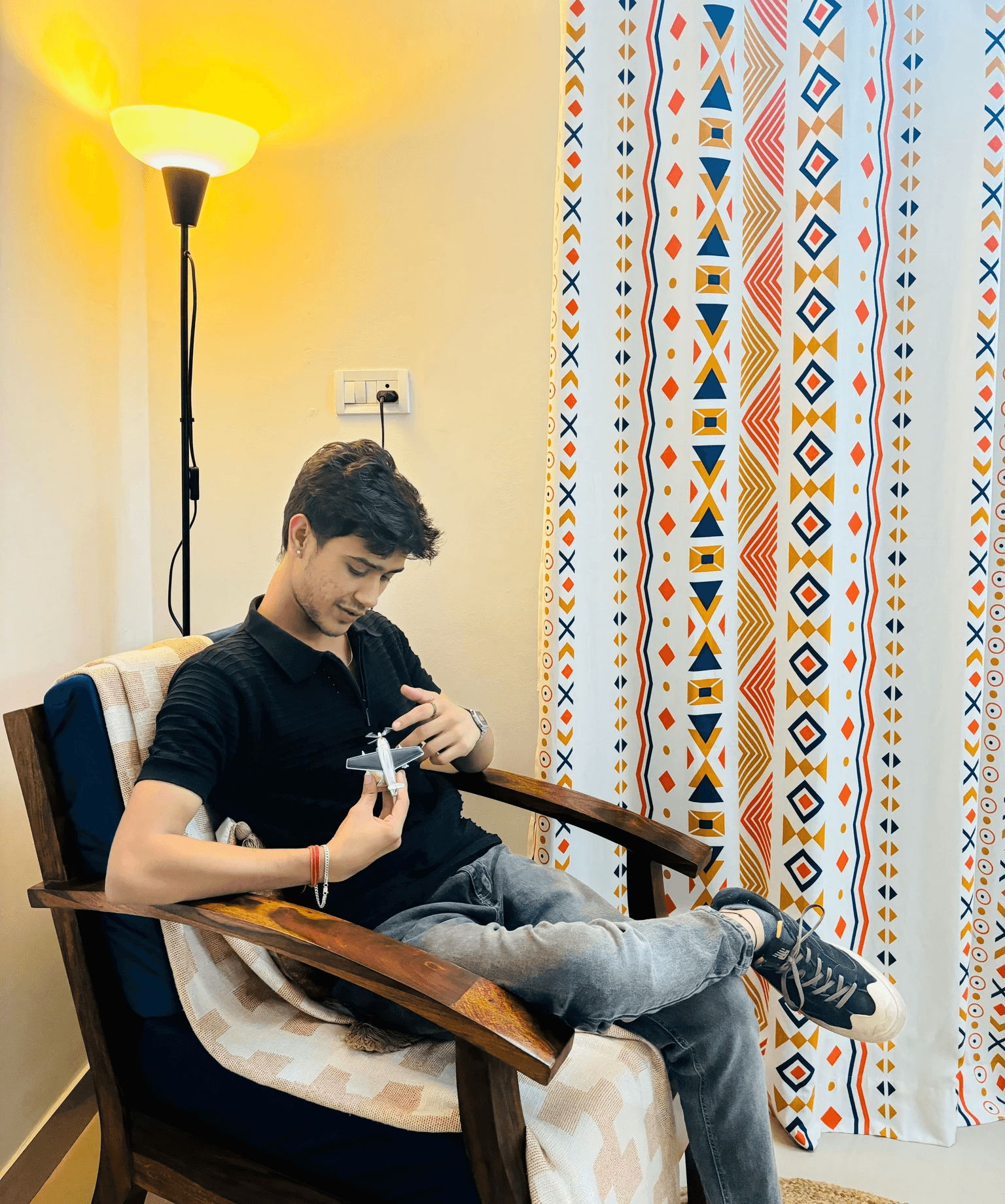
A curious mind with a sketchbook heart and a Figma brain, designing experiences that feel as good as they look. Whether it's simplifying complex systems or crafting interfaces that talk back nicely, I thrive at the intersection of clarity, craft, and a little bit of chaos.
From startup scrambles to structured dashboards, I design with intent and a touch of magic. Currently shipping with Mobility Infotech, open to focused, ambitious teams.
Product design, UX research, IA, design systems
Figma, Framer, Protopie, Notion, Linear
Systems thinking, motion, visual craft
Fintech, EdTech, AI, SaaS, Web3
Open to product design roles, collaborations, and select freelance. Average reply time: under 24 hours.
In 2024, Artfi, a blockchain powered art investment platform, faced a challenge. Its ecosystem had grown into four separate products: Artfi Token, Artfi Connect, Artfi Share, and Artinals. Each served a purpose, but together they created a fragmented experience. Investors had to jump between platforms, manage scattered data, and deal with confusing workflows.
This case study explores how I led the end to end design of Artfi Curated, a unified dashboard that brought the entire ecosystem into one place.
I worked as the product designer on this project. My role was to shape the experience from early ideas to final handoff. I collaborated closely with the founder, product team, and developers to align on goals and priorities. I also guided design decisions during iterations, making sure the app stayed simple, functional, and easy to build.
We wanted to understand how people feel about art and why they hesitate to invest in it. To do this, we spoke with 10 participants including young professionals, art enthusiasts, and first time investors. The goal was to uncover the fears and expectations around art as an asset.
The research showed that most people see fine art as expensive and out of reach. Many participants were interested in the idea of fractional ownership but worried about trust and transparency. They had questions about how secure the investment is, and whether they could resell their shares easily.
These insights helped us focus on building clarity, trust, and simplicity into the product experience.
said fine art feels too expensive to even think about investing in
were interested in fractional ownership but had low trust in online platforms
said they were confused about how the value of art is calculated
wanted an easy way to resell their shares but felt unsure if that was possible
How can we create an art investment platform that makes fine art feel accessible, builds trust through transparency, explains value in simple terms, and gives people confidence that they can resell their shares easily?
Three goals that defined success for the launch, measurable, user centered, and tied to the trust gap we surfaced in research.

Increased trust in fractional art investment through transparent on chain proofs.

Onboarded 25,000+ investors across 12 countries within six months of launch.

40% repeat investment rate within six months, a strong signal of growing platform confidence.
After several explorations and early beta versions, the product went through six to eight months of refinement. Each step was shaped by user feedback, helping us simplify flows and build more trust into the experience.
Artfi taught me the importance of balancing creativity with usability. While art demands beauty, investors needed clarity and efficiency in navigating complex tokenised assets.
I'd prioritise testing across different user groups earlier to refine accessibility and engagement flows.
Great design for creative platforms lies in bridging storytelling with functionality, making art and finance feel seamless together.
Explore the live product or see another case.
Founded in 2020, Wilgax grew from a small team serving local businesses to a global digital partner with clients across the US, UK, Dubai, and Asia.
Their growth story, 500+ projects, 50+ clients, and consistent ROI boosts (avg. 250%), was powerful. But their old digital identity didn't reflect that momentum. They needed a new face that would inspire trust, feel modern, and instantly communicate results & innovation.
That's where my role came in: to craft a design system and storytelling driven UX that matched their ambitions.
Most digital agencies today fall into one of two traps:
Wilgax, as a fast growing AI enabled digital solutions company, needed a presence that could:
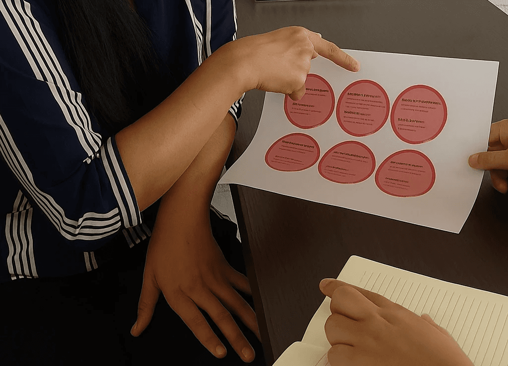
Through research into competitor agencies and stakeholder feedback, I uncovered:
of client inquiries came through "Book a Call", showing high intent and trust in direct engagement.
of service requests were for AI driven solutions, highlighting growing demand for automation.
of repeat visitors explored the Services page, with Web & App Development the most viewed.
total traffic came from international clients (US, UK, Dubai), validating global expansion.
How can we create a digital agency platform that minimises decision friction for potential clients, simplifies navigation across services, ensures credibility through transparent data and testimonials, and provides a clear and motivating path toward booking a call without overwhelming the user?
Three signals that defined a successful redesign, anchored in trust, clarity, and conversion.
Built stronger global trust through proof led storytelling and testimonials placed up front.

Clearer navigation that reduced user decision friction across services and case studies.
Increased qualified leads with a direct, motivating "Book a Call" path on every key surface.
The final experience delivers:
Driving a premium digital presence.
Building Wilgax reinforced the power of AI in transforming service workflows. Automating tasks like lead generation and campaign management gave the team more time to focus on strategy and client success.
I'd map out clearer onboarding journeys for clients so they instantly see the value of automation instead of needing explanations.
Service platforms thrive when they blend intelligence with simplicity, helping teams scale impact without scaling complexity.
Explore the live site or see another case.
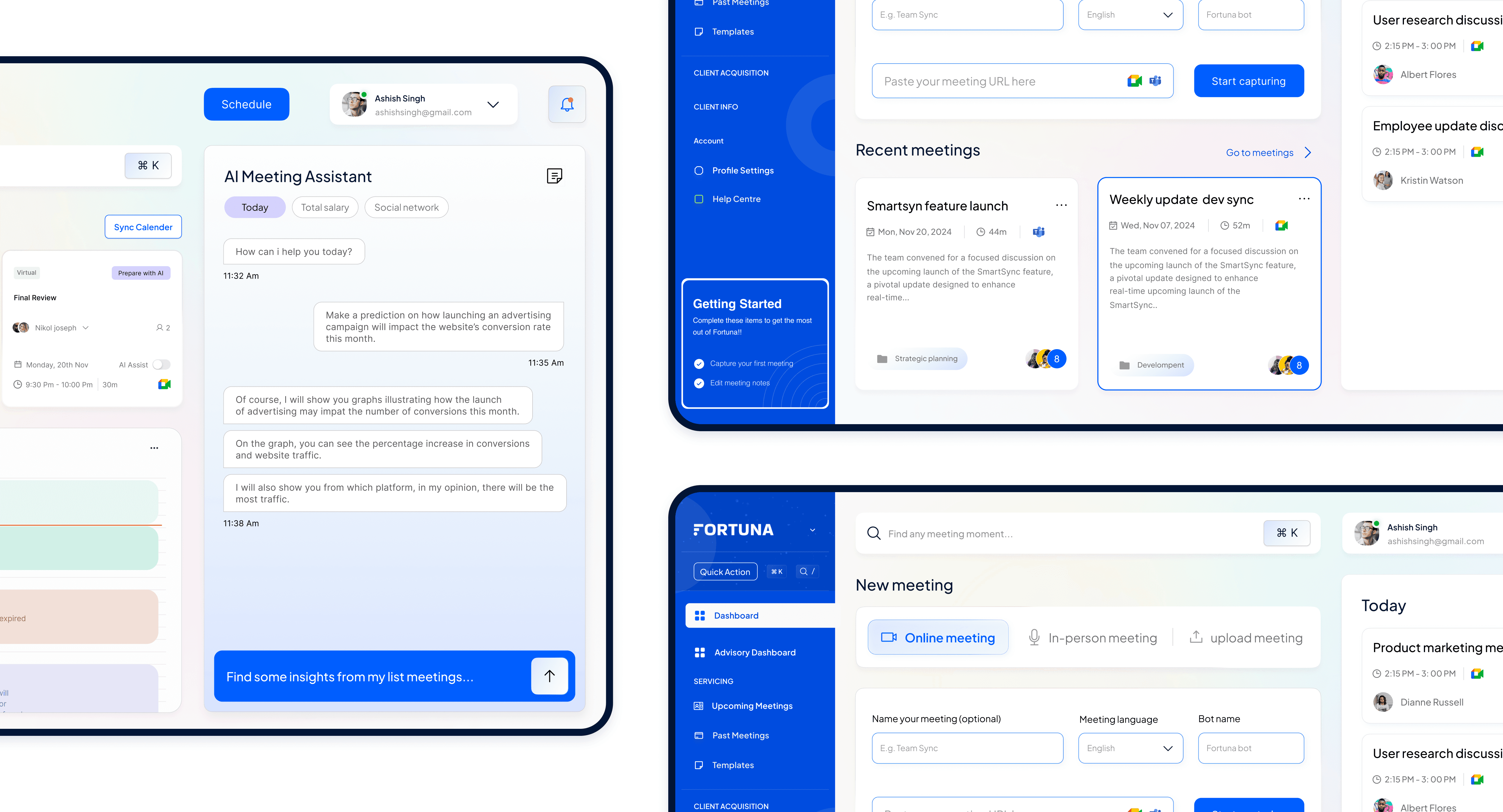
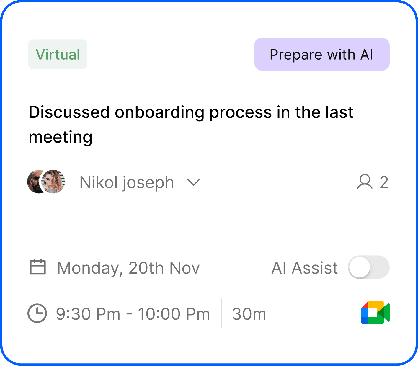
Fortuna is a meeting platform that goes beyond simple scheduling. Teams often struggle to stay organised, recall past discussions, and prepare effectively for upcoming meetings. Fortuna solves these challenges by creating a seamless experience that combines scheduling, smart summaries, and AI enabled preparation, empowering professionals and organisations to make every meeting productive.
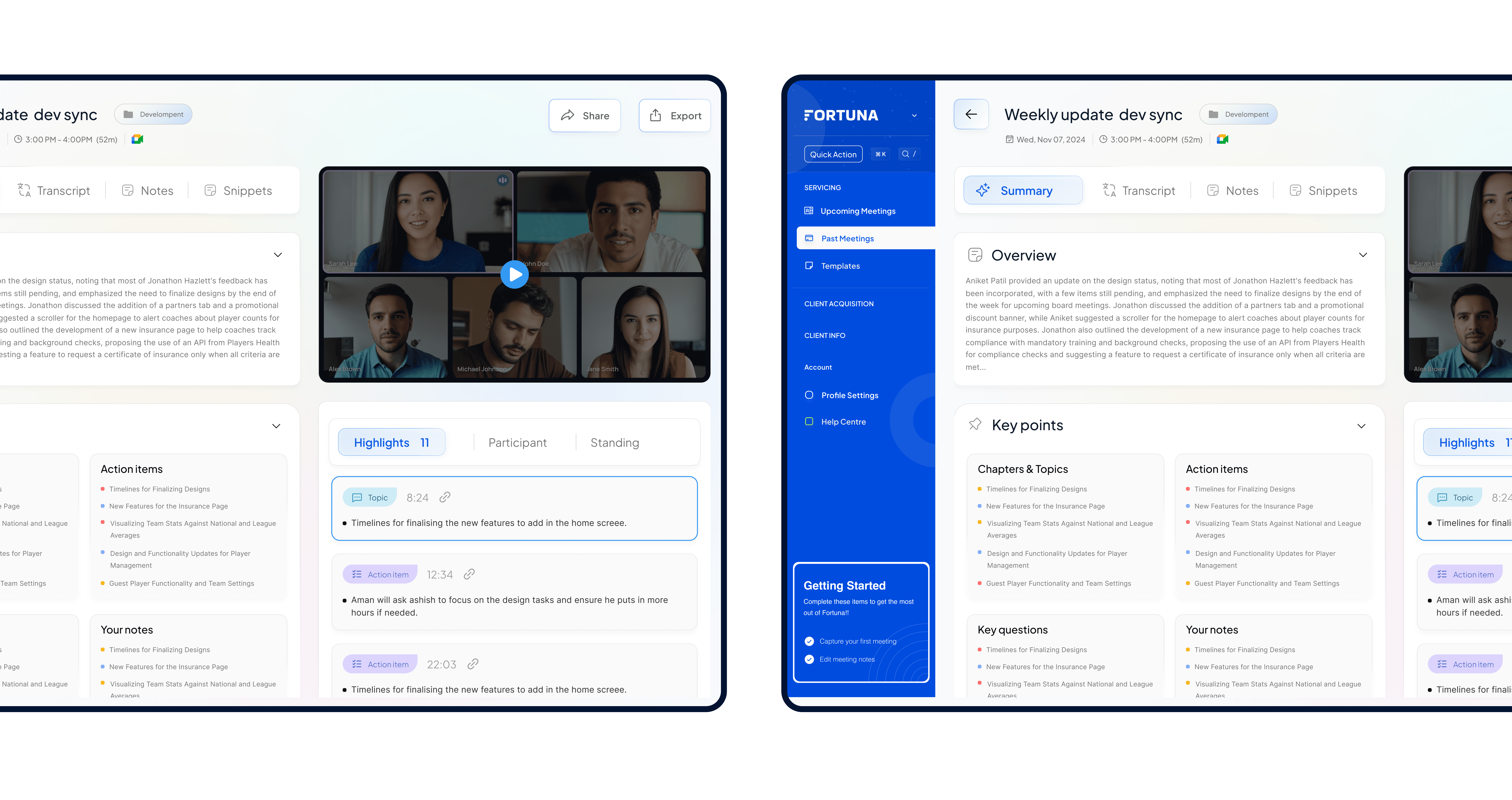
Fortuna
6 Months
Productivity / SaaS
Product Designer
2024
I led the design vision for Fortuna, collaborating closely with the product and engineering teams. I also guided two junior designers and coordinated with stakeholders across Product Management, Engineering, QA, and Customer Success to ensure the solution met real user needs.
To understand the challenges professionals face in meeting management, we conducted a comprehensive study with 20 participants across different industries, including tech, consulting, and startups.
Key insights included:
of professionals reported missing at least one key discussion point from the previous meeting.
felt underprepared before joining important meetings.
relied on scattered notes across emails, chat, or docs to recall past discussions.
said they spent over 15 minutes preparing for each meeting.
To uncover the true needs of the user, I explored the root cause through a thoughtful reflection process. Instead of stopping at surface level insights, I kept asking "why?" diving deeper until the core motivation came into focus.
Here's how it unfolded:
Key Insight: Users need a platform that not only schedules meetings but also provides clarity, personalised summaries, and actionable insights.
"A meeting without preparation is just a waste of time, Fortuna makes every minute count."
With clear user needs in mind, I explored solutions to improve meeting management, preparation, and follow through.
The Solution. To address the core problem, I applied the "How Might We" approach to reimagine the meeting experience.
How can we make meetings feel organised, insightful, and stress free?
The solution combines:
By integrating these features into a seamless interface, Fortuna transforms meetings from time consuming obligations into clear, actionable, and productive sessions that professionals can feel confident about.
Three north star outcomes that defined a successful launch.
Faster meeting prep, users feel ready in minutes, not hours.
120K+ users within the first six months of launch.
70% AI prep usage consistently before meetings by month two.
Refined through feedback, Fortuna delivers a clean dashboard, AI summaries, quick prep, and smart notifications for productive meetings.
Driving smarter meetings, faster decisions.
Building Fortuna highlighted how vital simplicity and clarity are in scheduling tools. Users valued quick access to meetings and clear summaries more than complex features.
Next time, I'd run usability tests earlier in the prototype phase to catch navigation pain points before scaling designs.
Productivity tools succeed when they reduce friction, helping users focus on collaboration instead of managing logistics.
More work waiting on the homepage.
Building your own Uber costs millions and years most transport operators simply don't have. Mobility Infotech changes that. It hands them a fully branded rider and driver platform they can launch in weeks, not quarters. I was the only designer in the room, sitting next to the founder and the engineers, turning a blank canvas into a launch ready product across iOS, Android, and web. I owned the research, the architecture, every flow and screen, and a themeable design system built on one honest idea: one core experience that quietly becomes a taxi app in one city and a shuttle app in the next, without rebuilding it each time. Sixty four days, start to ship.
Mobility Infotech
64 Days
Mobility · Logistics
Solo · End to end 0 to 1
Web · iOS · Android
I was the only designer on the product. My job was to take a multi modal mobility platform covering taxi, carpool, shuttle, bike, and rental, and move it from nothing to a launch ready system across three platforms, in a way that could be re skinned for a hundred different client brands without a redesign each time.
I owned research, information architecture, end to end flows, interaction and visual design, and a themeable component library. I worked alongside a product manager, the engineering team, and the founder, so a large part of the role was keeping everyone pointed at the same target when there was no design team to lean on.
Every city needs ride hailing, carpooling, shuttles, and local delivery, but the giants don't serve everyone. Regional fleets, country specific operators, and niche markets get left behind.
Mobility Infotech sells the ability to run a ride business, branded, ready in weeks, at a fraction of the cost. It's the arms dealer position in a gold rush: when everyone wants to mine, sell the shovels.
I studied how people actually choose a ride app in emerging markets, and tore down the incumbents like Uber, Ola, and BlaBlaCar for the patterns riders already trust.
How can we design one mobility system that launches a new brand in weeks, earns trust through transparent pricing and safety, and works as a taxi, carpool, shuttle, and delivery app at once?
The rider app opens with intent, asking "What's your plan for today?" above a single destination field, so five service types never overwhelm a first time user.


Each vehicle option carries type, capacity, drop time, distance away, and a bold fare on a single scannable row. The whole decision sits in one glance, with no drill down required.

Stored value balances create anxiety, so every credit and debit is sign and colour coded and filterable (All / Added / Deducted). Beyond the wallet, trust is designed into every safety and pricing detail.

I designed every booking step over a live map, elegant on a flagship and heavy on the budget phones much of the real audience carries. The honest lesson: design for the slowest device your user actually owns.
Scaled and stayed loved at the same time, the hardest thing to do in a two sided market.
In marketplaces, trust is the growth strategy. The features that protected users, like transparent fares and visible safety, were the same ones that drove adoption.
Wire analytics into the first flow, not after launch, so the product teaches instead of just performing. And test on representative low end hardware in week one.
A platform's real customer is the next customer. Designing for the second brand you haven't met yet is what makes the first one scale.
More work waiting on the homepage.
India has 500 million daily commuters. Togopool's promise was simple, share a ride, save money, reduce your carbon footprint. But a promise needs a product that delivers it. This case study shows how an end to end design process turned that promise into a platform with 500K+ users, 10M+ rides, and a 90% recommendation rate.
From onboarding flows to trust architectures, from UX writing to payment transparency, every decision was shaped by one question: what does it take for a stranger to trust a stranger with their commute?
Togopool
8 Months · 2024
Mobility · Carpool
End to end Product Design + UX Writing
iOS · Android

I led product design end to end across the Togopool iOS and Android apps, from early discovery and user flows to final screen design and handoff. My scope covered the core booking experience (Find Pool and Offer Pool), the trust and verification system, recurring ride scheduling, the EcoMeter feature, payments transparency, and the full UX writing layer across the app. I worked closely with product and engineering throughout, shaping decisions at every stage rather than arriving after them.
Carpooling is not a new idea. What's new is getting Indian daily commuters, conditioned by decades of solo travel, auto rickshaws, and app based cabs, to share a vehicle with someone they've never met. Our research focused not on whether people wanted to save money (they did), but on what was stopping them.
We interviewed 14 commuters across Gurugram, Pune, and Bengaluru: a mix of corporate employees, students, and gig workers. Every conversation pointed to the same three fears: safety, unpredictability, and money confusion.
said they'd tried a shared ride app before but stopped due to unreliable or uncomfortable experiences
ranked "knowing who I'm riding with" as more important than price when choosing a carpool
were confused about how earnings and promo credits differed in existing apps
said they would use carpooling daily if they could set a recurring ride without re booking each time
How can we build a carpool experience where users feel safe enough to get in the car, confident enough to offer their own rides, and loyal enough to come back tomorrow, without making the product feel like a security checkpoint?
Three goals that kept every design decision grounded, user centered, measurable, and directly tied to the trust gap our research uncovered.
A trust system that scales. Users should be able to make a confident ride decision from the results screen alone, no profile deep dives required.
Habit, not transactions. The product should make recurring use effortless. Booking fatigue was the biggest churn driver, we designed it out.
Impact you can see. Every ride should feel like it matters beyond the commute. The EcoMeter needed to make sustainability personal, not abstract.
The design unfolded in five phases, each building on what we learned before moving forward. No assumptions carried unverified into the next stage.
Interviewed 14 commuters. Mapped every touchpoint where trust breaks down, from the first search to post ride settlement. Audited BlaBlaCar, OLA Share, and QuickRide for patterns worth learning from and patterns worth avoiding.
Built dual mode IA for Ride Taker and Ride Giver with shared infrastructure. Mapped the critical trust decision points, where users would hesitate, and what signal at that moment would move them forward.
Iterated on low fidelity flows for the booking funnel, trust badges, and recurring ride scheduler before moving to high fidelity. The Preferences screen, with its "Talkative" toggle, came late and changed everything about how personality was communicated.
Rewrote every label, button, empty state, and notification with a mobile first, multilingual Indian audience in mind. The rule: shorter is never enough, it has to be the right word. "Talkative" beats "Communication Preference." Clarity over cleverness, always.
Ran usability sessions with 8 participants covering the full booking flow, trust badge comprehension, and payment screens. Key finding: users understood the three tier badge system without explanation, visual hierarchy did the job copy couldn't.
Six features that defined Togopool's experience, each solving a specific user anxiety identified in research.
Three tier trust badges. Corporate, Govt, and Non Verified colour coded badges give users a decision framework at a glance. The safe choice became the easy choice.
Recurring ride scheduler. Setting a recurring ride removes the daily decision to rebook, turning a considered action into an automatic habit. Directly addressed the biggest cause of churn.
EcoMeter CO₂ tracking. Showing precise fuel saved and CO₂ reduced makes environmental impact personal and shareable, turning sustainability into organic acquisition.
Payments transparency. Separate buckets for Earned Money vs Promo Balance, with the 30% promo cap displayed upfront, reduced support queries and built financial trust.
Route match percentage. Showing 100%, 99% etc. on every result card lets users make quality judgments instantly. The product did the matching work, users just confirm.
Preferences as personality. Route, music, gender, smoking, charging, and "Talkative", the last label signals Togopool understands comfort, not just logistics.
The product shipped across iOS and Android after 8 months of iterative design, user testing, and close collaboration with engineering. The experience spans onboarding, Find Pool, Offer Pool, live tracking, payments, EcoMeter, and a preference driven profile, all connected by a language layer that felt native to the Indian commuter.
UX Writing, Before & After
Onboarding Flow, First Run Experience
Welcome, value proposition up front
Easy Connections, match quality framing
Ride Green, sustainability as payoff
A three step intro that earns the signup: lead with the value, prove match quality, then close on the dual reward of saving money and cutting emissions, the same EcoMeter story the product delivers on.
Trust in shared mobility is built in layers, verification, ratings, preferences, match quality. No single feature does the job. The design challenge is stacking these layers without making the interface feel like a security checkpoint.
Serving multilingual, mobile first users means every word carries more weight. "Talkative" beats "Communication Preference." Clarity over cleverness, always, and upfront disclosure of limitations (like the 30% promo cap) maintains trust far better than hiding it.
The recurring ride feature taught a lasting lesson: the biggest UX win isn't making a task easier, it's making it unnecessary. Design that removes the need for repeated decisions is design that compounds over time.
Explore the live app or see another case.